This site will stop updating, but the updates will continue in the new site. It is at http://pixel.oceansdream.net, please update your links if it points to tilesettutorial.wordpress.com.
Visit the new site
Posted in Uncategorized
RMVX water tiles
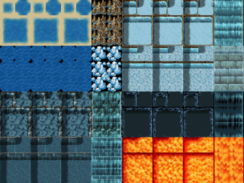
This is Tileset A1 from RPG Maker VX.
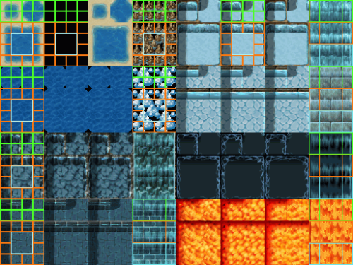
These are water tiles (well lava isn’t water but it’s used much the same way). I’ll set a grid so you can see how to position things in it.
Here it is. In this water tile sheet though, you’ll find that if you change the position of some tiles, it’ll change how it works. For example, I put a waterfall tile block over the bottom left side. Instead of animating like a waterfall does, it shows the first frame, then shows the next 2 water frames to the right of it. So if you want waterfalls, use them in the correct spots. 6 places for waterfalls.
You have 8 auto-tiles which have 3 of them in a row. This is for the animation. It should go from 1 to 2 to 3 and back to 2 and 1 so it can cycle over.
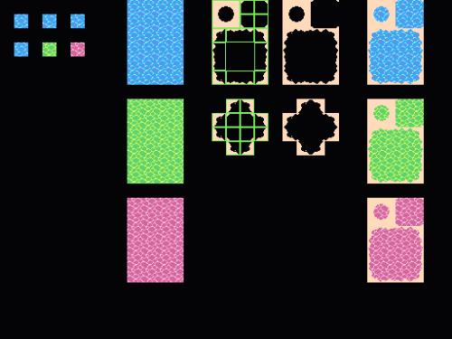
I made 3 16×16 water tiles, that would animate. I made the animated ones green and pink so they stand out here. Rather than make the land/water connection on top of the water tiles, I do it on the side. This is good for the water autotiles that have 3 of them in a row. I would worry about the shape of the land before you go shading it in, like making sure it tiles. Then paste it on the water. That’ll do for one of the 8 three in a row animated water tiles.
Some of the water tiles have shadows on the left side, and a floor tile (with water above) on the top row of it. You can put these in if you want. If you have a program with layers, put the water tiles on a layer above the floor tile you want to use. Then make it semi-transparent (some have it as alpha channel). I did this in Graphics Gale. Add a layer, make sure it’s in 24 bit color, then reduce the alpha to about 100. For the shadows, it was a simple reducing of brightness for the selected water, but you could do a hue shift too which would get some better results.
This is from an earlier post, but it’s still good here. See the rocks (brown and ice) on the 4th column? You can take a similar approach to this there:

This is 2x the actual size. It should be on a transparent background. Then it will make rocks over the water.
Now for the waterfalls:
I made a 16×16 waterfall tile. Then I shifted it down 6 pixels (the 6 pixels on the bottom get moved up to the top) for the 2nd waterfall tile. For the 3rd, I just repeated that process with 5. The animation goes from 1 to 2 to 3 to 1. So the reason I chose the shifting that way is because the tile is 16 pixels tall. 6 (first movement) + 5 (second movement) + 5 (back to the first) = 16. You can play around with this of course but I thought that worked well enough for me.
Then you can do the same as you did for transparent floor tiles, except it’s with walls this time. I didn’t want it transparent but you can do that. I copied the waterfall tile so there’s 4 of them in a row and 2 rows. The 1st and the 4th columns are for the sides, the middle part should repeat.
You should test your tiles out in RMVX to make sure it works as you think it does.
Posted in auto-tiles, nature, RPG Maker VX
The tao of pixel art
I wonder why I haven’t linked it before. It’s an interesting read. I’ll quote some of it here.
Attempt pixel art beyond your comfort zone. Be ready to face failure, for you will learn from it! Don’t do the same thing over and over again!
When challenging yourself with difficult Pixel Art subjects, new solutions will come to you!
Do not be ashamed of past errors! Be glad for them and push forward! Do not try to just outrun your friends. Don’t just try to outrun the bear. Try to outrun GOD. There is no limit!
Posted in fun
Background updates
I went back to the earlier posts that had no names, and named them, as well as replacing old pictures whose links are dead. I should go and save these pics sometime so they’re not gone forever if imageshack decides to go deleting and stuff.
I had a good idea for a next tutorial, based on the idea that I got off of “redraw your old stuff”. So I’ll redo an earlier tutorial and see how it turns out. I have another idea for RMVX water tiles, so I’ll do that when I have the time.
Posted in Uncategorized
8bit canvas pixel art videos
These are videos on 8bit canvas doing some touhou pixel art scenes/characters. I didn’t do these either but I thought this would be interesting to see, I like the style. I need to come up with my own stuff sometime D:
If I find any other interesting youtube process videos or images, I’ll post it too. Hope you like, and I’ll start planning for my own tutorial later.
Sprite video
This video is not by me, but I figured I’d post it up. If you ever played the games Immaterial and Missing power, Scarlet Weather Rhapsody, or Unthinkable natural law, then you’d see the types of sprites that are used. If not, I’ll post an example here:
You can get the video here, you may need an flv viewer though.
See the original on Nicovideo if you have an account. Actually, I can’t read japanese so I’m not sure if that is the original either, but that’s where it was found. It’s a 6 minute video, going through the whole process of making the sprite.
Fighting game sprites
I know I haven’t been updating this for a while, I’ve been busy with my own pixel projects.
I think it’s pretty interesting to see how they do the King of Fighters XII sprites.
It is not necessary to do the animations/characters in 3D first, this is just their method so they can get bigger sprites and standardize animations more. They have a big section in yellow about the use of 3D.
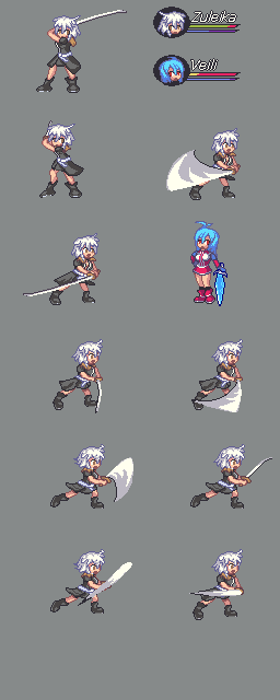
Here is an animation sheet I did for Skie’s character, Zuleika from Sacred Earth bonds.
I will mention this in advance, this was a 2-3 hour animation job and I don’t have a massive amount of animation experience so I cannot show you how to make awesome animations. I would probably refer to fighting game sprites for that and looking up pictures on animation. I’m sure there’s a bunch of stuff out there, I’ll try to get a few when I go out looking for them.
Not perfect, but here’s the resulting animation. I did not use all the frames in the sheet, some of them are newer after I got feedback. The top left corner and the bottom right corner sections are the frames I used. Some animation frames are small enough of a change so that you can just edit the existing sprite. A simple soft breathing pose would fall into that. For the attack, I redrew the character for when she goes forward to strike in the 3rd frame. Depending on how complex you want your attack you may need to do a lot more redrawing instead of editting. I built in the sword slash effect onto the sprite, I’ve seen some where it’s an outside battle animation.
I would do the frames unshaded first. You shouldn’t make the initial sprite, shade that and then try to edit it and get all the animation frames out of that shaded sprite. If you look at a fair amount of fighting game sprites, they have few colors but they’re very high contrasted.
Here’s a Guilty Gear sprite. May! If you check it out, they don’t use tons of shades. Each color probably has 3 variations of it. A dominant light color, a noticeable dark color, and a small amount of a midtone. You don’t have to copy this style, but having a nice simpler shading style can help it be less difficult to shade all the frames you do for an attack.
Tsugumo has a tutorial on this too. You can check it out here.
I have Vanguard princess sprites as well. Save it and zoom in on it. It has a few tones, but it’s pretty much simple shades. I don’t know if there’s some non-manual rotation or something done because some have shades that seem too soft to be noticeable but for the most part there’s the high contrasted shades and a few for each color type.
The rest is just practice, seeing commercial quality sprites, learning more on animation, and getting the feel for the human body and how it moves and the various poses. Fighting game sprites take a long time to come out, and then when you have 300+ frames of it…
Amelia sprite video
Check out the video here:
Resulting sprite:
Feel free to comment and let me know what you thought about it. Not shown in the video, but I had in my other monitor a reference picture of Amelia. If you have a single monitor, you may have to switch windows or probably print out the drawing you want.
Cave: Part II
OK, onto part II of the caves. Here, I’ll be doing these things: Adding new side walls so I can hang stalactite supports on them, changing the floor color to match the cave, making an alternate version of the floor tile, cutting out a part of the walls at the edges so it looks more natural, adding some ambient lighting to the walls, adding a plant, and stalactite supports going horizontal and vertical. Sounds like a lot, but a lot of them are simple and can be done in a few minutes.
So here’s the whole sheet. I’ll post a testmap shortly.
1) On top left, I have the original brown floor tile. It didn’t quite match the cave very well, so making it the same color as the cave helped it out a bit. Wasn’t quite a 3 step process, but character Maker has a color slider to the left of the palette, so I was just adjusting the colors around until I liked it. I wanted it overall blue/purple, had to make sure there wasn’t too much contrast either.
2) K-hos told me to add another floor tile for variety. So I made it with bigger rocks. I started with circle shapes and made the highlight areas bigger. Cleaned up the lineart, and added another highlight on top to make it stand out a little more. Had to tone it down because it was too much.
3) To the right of that, there’s a side wall that has a straight edge. We’ll need that for the stalactite connection, if not it’ll look like it’s floating.
4) Cutting out from the side walls. This part should be a seperate side wall, so don’t cut into the only side walls you have. You’ll want those to tile. Only the side wall at the end should be cut, so it looks more natural. Usually what I’d do is cut most from the middle, and mostly leave it alone near the top/bottom. This can be applied to both sides. If you have cave walls that tile vertically, make sure that cutting the side walls still has it tile.
5) This is the ambient lighting part. This is not necessary, but can have interesting results. So if you don’t do this on the walls, then don’t do it on the other objects either. I took the side wall on the right (and only that one), and colored with a reddish purple on the edges of the mini rocks on the wall. You can see on the tiles that are 2x bigger the process I did on it. Then, I did a yellowish highlight. Pink could work too.
6) This part wasn’t hard, I just replaced the highlight on the side wall on the left with a lighter more saturated blue/cyan. It looks like it sparkles a lot more now. I’m not going to do this with the middle wall so that should be left alone.
7) Horizontal stalactite support. Basically, the player will go under this, and it will connect from one part of the ceiling to another. It’s best to get the shape down first. The ambient lighting here will work in the same way that it does for when you do the side wall. So for the front, I just decided to make some stalactite formations, sort of like what you see on the top part of the walls.
8) Plants! This one was a bit of a pain, as I had to constantly adjust the colors on it. For objects like this, it’s good to check out how it looks on a floor tile. After it’s all done, I put a shadow. I added some small patches of grass next to it, so that could also add some variety to the map. Only 2 colors for the grass itself, and you could use 1 if you wanted.
9) Stalactite support, going up and down. The middle part will tile, the top and bottom will connect to the ceiling. Getting the shape right is probably the most time consuming part of this one, although it’s not that bad. Make your stalactite formations on the top part. Since the reddish lighting that we’ve been using has been on the right side of the wall, we’ll continue it here too. Don’t go switching it, if it’s blue on the left sidewall, don’t forget to do the same on the objects.
Result!
Cave: Part I
OK, I was asked to do a cave tileset here, so I’m gonna start.
I started with the basic shape that I wanted. I didn’t the ceiling to feel too squarish so I wanted to have some variation there.
I started with the color red. I actually took the 4 colors I was using at first off of a Sword of Mana tile. I had saved a bunch of those and a Seiken Densetsu 3 one for reference. More on that later. But yeah, I just wanted something to work off of, I wasn’t going to keep those colors.
I wanted a stalagmite type of formation on the bottom of the cave wall. Then little stalactite like formations around, you can probably see that most on the right/left side walls. As in the Cliff tutorial I posted before, you’ll want the tops of them to be lightest. I could have simply made one tile for the front and one tile for the right side cliff which then I could mirror, but I figured I’d have some variation. For reference on the side walls, I looked at Seiken Densetsu 3 cliff sides. So no, I didn’t just imagine it up.
For the ceiling, I’m using one color. Then one color to basically outline it. I could make the outline thicker if I want.
For the floor, I tried to make it look rocky, so I scattered a few light pixels here and there, and some dark pixels for depth. You’ll want to test how it tiles so that it doesn’t look like a bunch of connected squares. You could even make multiple types for variation, which will make the tiling even less obvious. For floors, try not to make the contrast too high. I did at first only to show where I put the shades/highlights, but you’ll want them just slightly visible without sticking out too much.
Testmap
Posted in Floor, nature, RPG Maker XP, Wall
